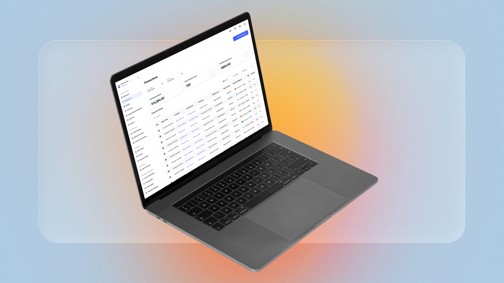
The Problem
Merchants weren't having the best experience with the Transactions page on EBizCharge Cloud. Transactions was split into two tabs, New Transaction and Transaction History, and users landed on New Transaction by default. That meant a lot of merchants started in a creation flow even when their intent was lookup, reconciliation, refunds, or research, forcing a context switch into a large form before they could navigate to what they actually came for.
EBizCharge's mission is to modernize companies and make them more efficient, and this page wasn't accomplishing that goal. Cloud was undergoing a UI modernization, and we wanted to take Transactions a step further: enhance not just the look of the page, but the workflow itself.
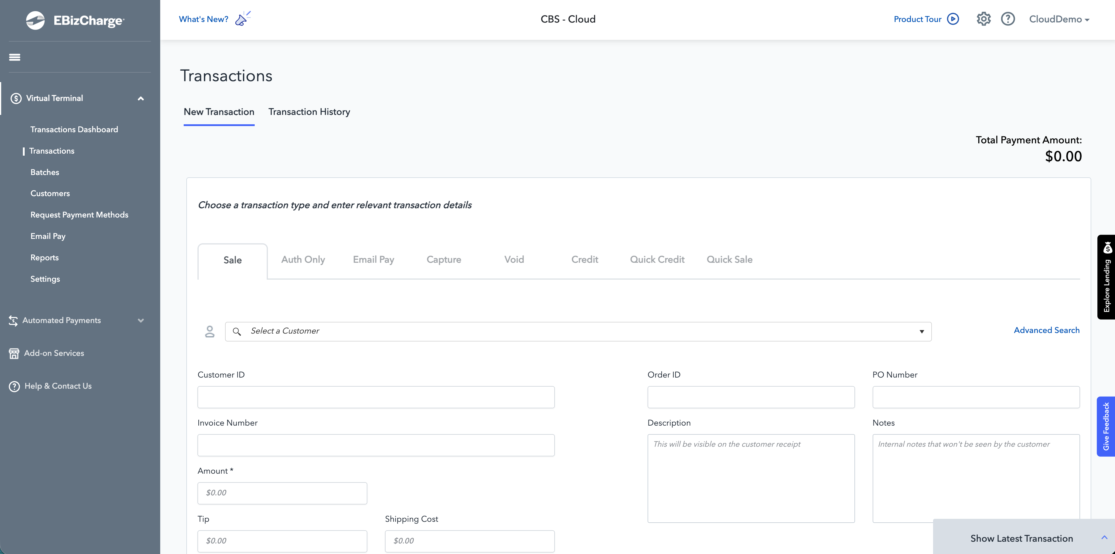
The Transactions page before the redesign.
Discovery
Early conversations with the Support team surfaced a telling behavior: merchants were disabling the data charts on the Transactions page. The charts were slow to load and took up valuable space, and merchants kept turning them off just to reach the table beneath. That insight kicked off a broader discovery effort:
- Stakeholder interviews with Support identified the three data points merchants would find most useful at a glance: Total Payment Volume, Total Transaction Count, and Total Refunded Amount.
- Usability testing with eight co-workers showed that most performed voids and refunds directly from the history table, always turned off the charts, and disliked tabbing between New Transaction and Transaction History.
- Six months of Hotjar data confirmed the friction: charts were switched off, back-to-back transaction creation wasn't seamless, and voids/refunds happened in the table, never in the New Transaction tab.
- Workflow mapping with accounting experts defined the ideal flow for every transaction type: Sale, Quick Sale, Auth Only, Capture, Post Auth, Credit, and Email Pay.
- Competitive analysis of five comparable systems revealed industry patterns and design elements worth learning from.
The Actions Matrix in FigJam: mapping the ideal flow for every transaction type with accounting experts.
All of it rolled up into a clear problem statement:
Merchants are burdened by the inefficiency of performing transactions, leading to wasted time and increased frustration. Data shows a potential for at least a 40% increase in operational efficiency by enhancing the workflow.
The Solution
We consolidated creating a transaction and Transaction History into one simple, streamlined page, designed around how merchants actually work:
- Transactions is now history-first. The page is built around Transaction History as the primary surface (date range, search, filters, export, and the table) with lightweight summary insights replacing the chart-heavy views merchants kept disabling.
- New Transaction is an intentional action. Creating a transaction happens through Add Transaction and a guided modal flow: pick the transaction type first, then complete only the relevant fields, with a Payment Method step appearing only when needed.
- Search matches merchant recall. Support confirmed merchants search by amount, last four digits of the payment method, and customer or account name, so history and search now support those real behaviors, reducing failed searches.
- Processing is safer and more consistent. The old screen exposed every transaction mode and field at once. The step-based flow lowers cognitive load, supports clearer validation, and surfaces non-obvious rules at the right time.
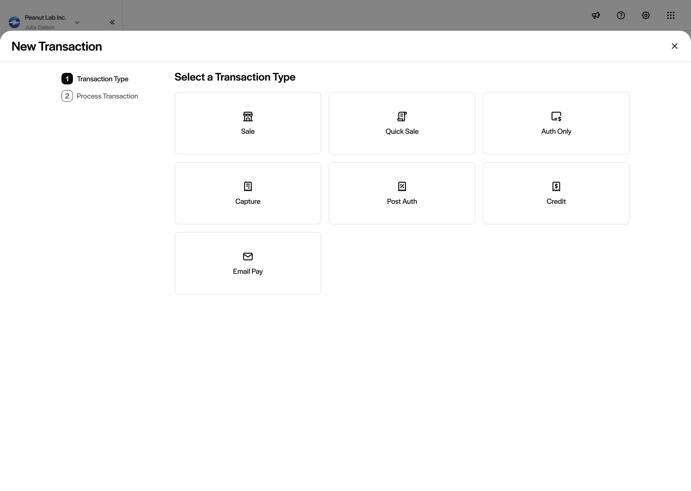
The new guided flow starts with an intentional choice: select a transaction type.
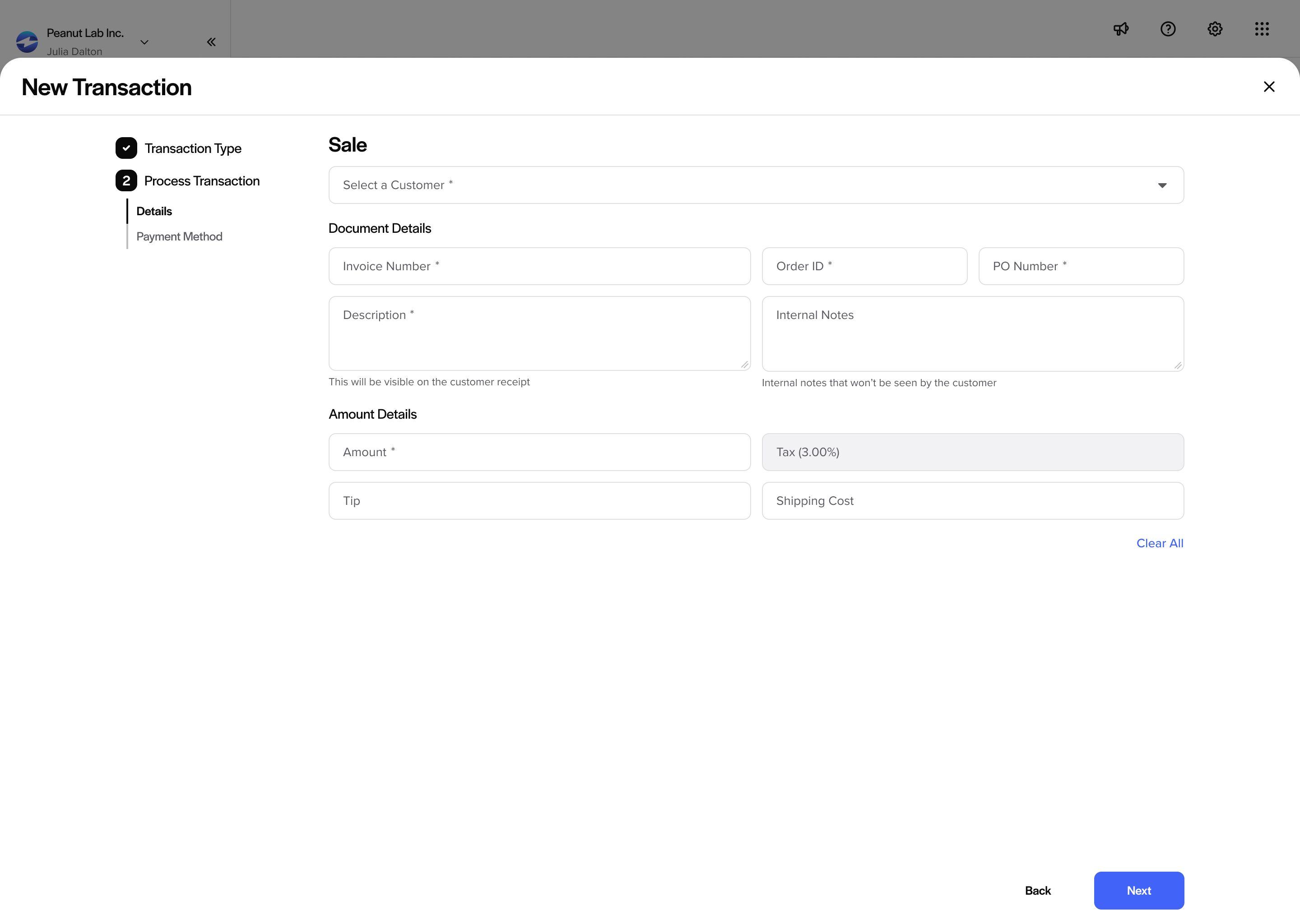
Each type shows only its relevant fields; here, the Sale flow.
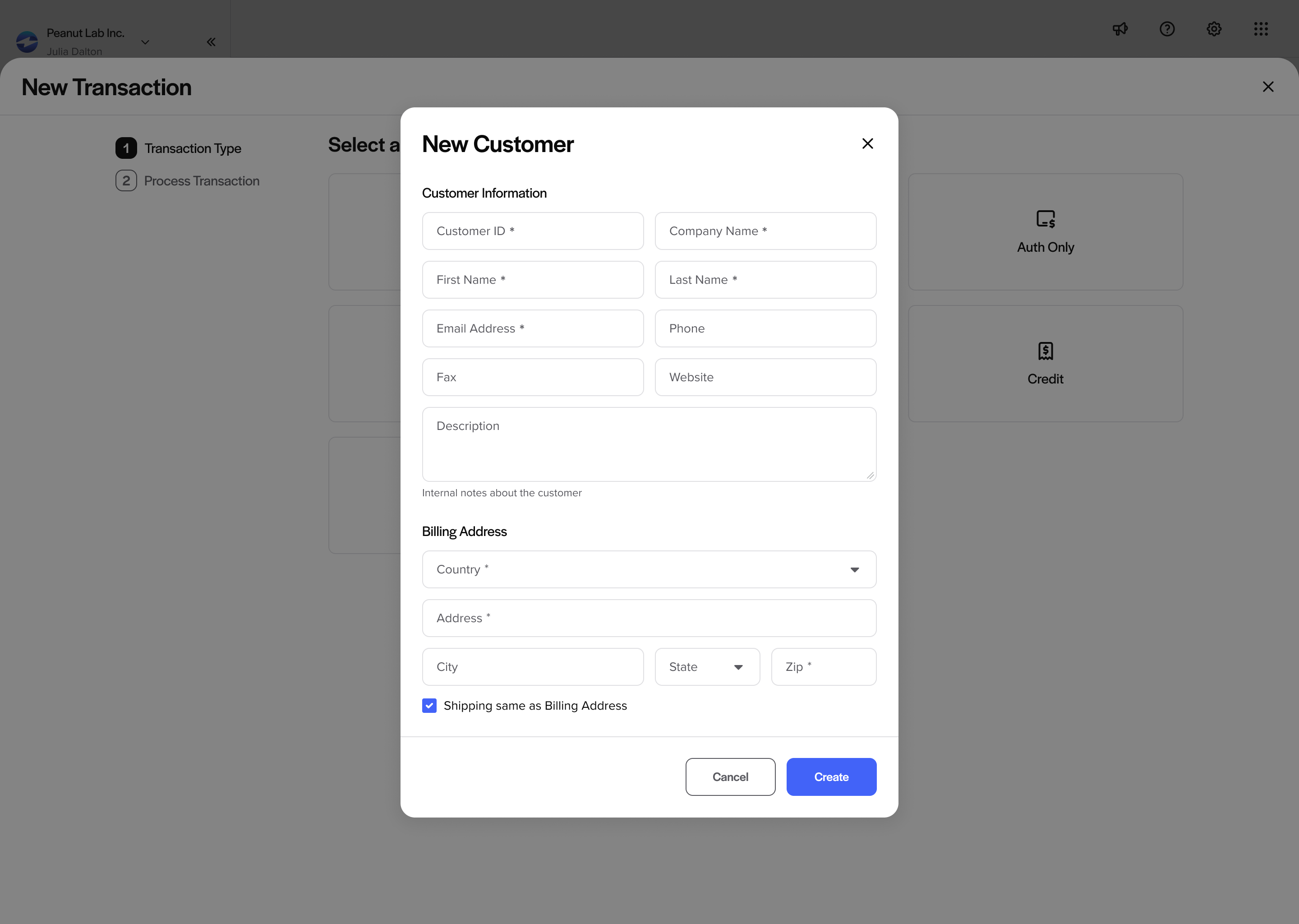
Merchants can add a new customer without ever leaving the flow.
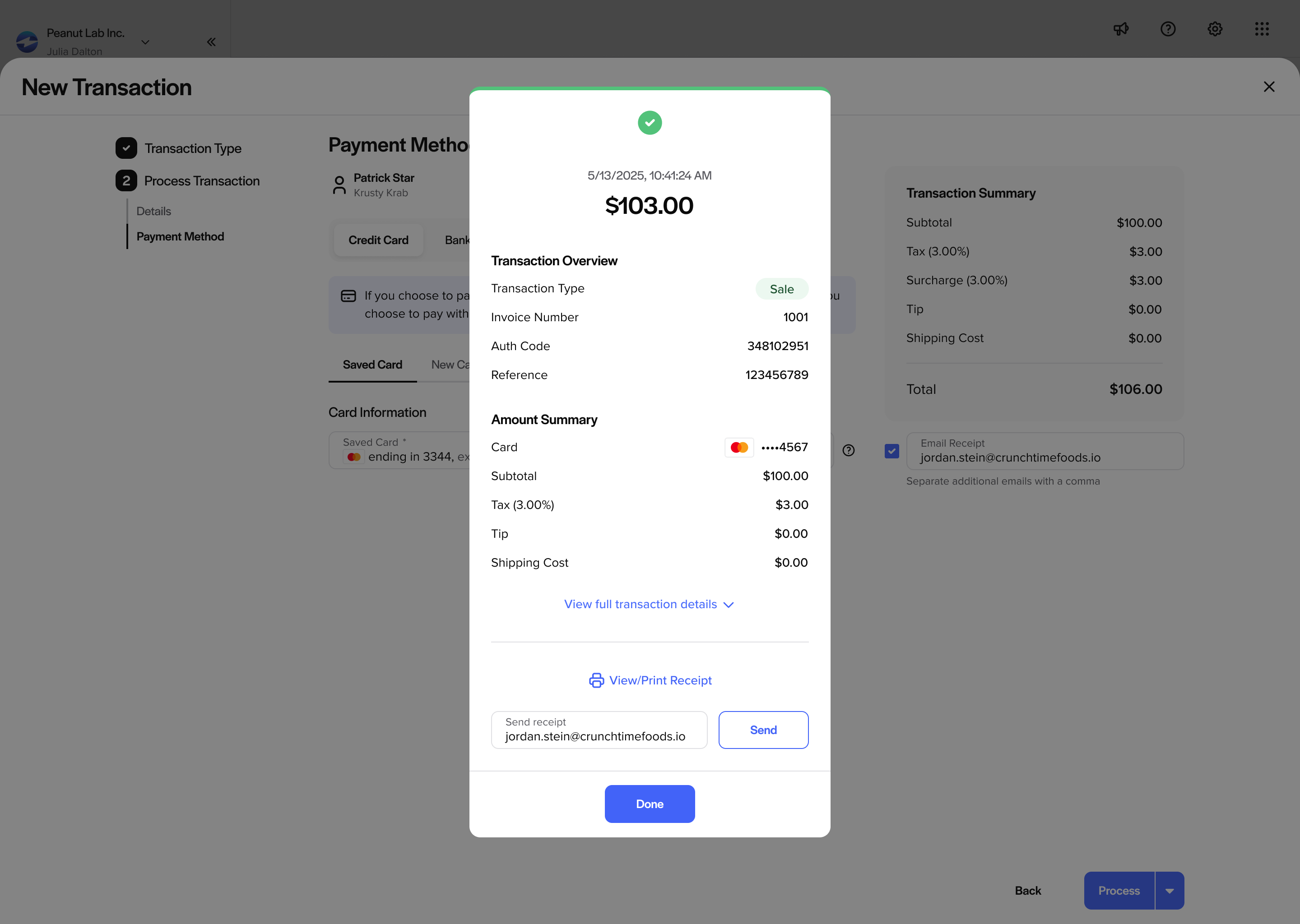
The updated receipt closes the loop with a clear summary and send options.
Usability Testing
The redesign went through two rounds of moderated prototype testing (plus A/B testing), run over Zoom with the UI/UX team: a first round with three merchants, and a follow-up round with two members of the marketing team after the first round's changes were applied.
Round 1: merchants. The goals were to validate whether the redesigned transaction types met merchant expectations for clarity and usability, to assess the convenience and efficiency of the new customer side panel for common actions, and to compare A/B versions of the side navigation.
- The unified flow worked. All participants found it intuitive and easy to follow; sales for new customers were completed without major friction, and voiding directly from the table proved to be the path of least resistance (7 seconds on average, versus 56.5 for a full sale).
- The side panels earned their place. Merchants liked having customer info, transaction history, and quick actions like voids and refunds without leaving the main workflow, and every tester found copying the reference number "easy".
- The new navigation won the A/B test. All participants preferred the updated grouping and iconography ("this collapsing feels more natural, my gut says this is the right one").
- And it surfaced real fixes: reversals felt out of place inside transaction creation (they moved to the History actions), the reference number needed to stay in viewport, receipts should send automatically, and reaching the full customer profile needed to be clearer.
Metrics and insights from usability testing with merchants.
Round 2: internal validation. After applying those changes, the goals were to retest the prototype with the marketing team to confirm the merchant findings, and to A/B test two collapsed states of the side navigation.
- The changes held up. Both testers found the flow easy and clear, instinctively performed the void from the actions column (validating the reversal move), and praised the stepper and loading animation.
- The panels kept working. Opening panels, swapping between them, changing the default payment method, and reaching the full profile were all easy and expected; the main ask was a larger, persistent copy affordance for the reference number.
- The nav question got answered. Both testers preferred the partially collapsed navigation with icons visible; a full collapse made the product feel broken, so the partial state shipped.
Metrics and insights from internal testing.
The verdict across both rounds: the new Transactions module is seamless, intuitive, efficient, and informative, with core tasks like creating a sale, voiding a transaction, and copying a reference number completed in under 15 seconds on average.
The Impact
Development is underway, and the redesign is built to deliver faster access to transaction history without extra navigation, a simpler and more predictable creation flow with consistent steps across transaction types, search and filtering that match merchant recall patterns (reducing support burden), and a scalable path to a dedicated analytics dashboard that can be optimized independently.
The core rationale: change the default entry point to match real intent, remove unnecessary navigation between tabs, and restructure transaction creation into a guided workflow, reducing errors while keeping performance and access-control constraints in mind. Discovery data pointed to at least a 40% increase in operational efficiency from these workflow enhancements.
Want to see more from EBizCharge? Additional case studies, including the Autopay and Text Pay are available upon request. Get in touch.